Content Analysis
Posted in Uncategorized on September 12th, 2010 by abarlow3Content analysis and compositional interpretation share a small amount of commonality. They both require you to set aside any kind of bias when interpreting and viewing an image. However, the difference between the two is that content analysis does not require you to have a “good eye”. Content analysis is performed by following a set of rules and procedures and is therefore “methodologically explicit”. As a result, the data produced is much more factual and accurate. Content analysis is very useful in numerous situations because it does not require any kind of art background, or education. It can be used for examining everything from magazine advertisements to movie scenes.
Image list
Categories
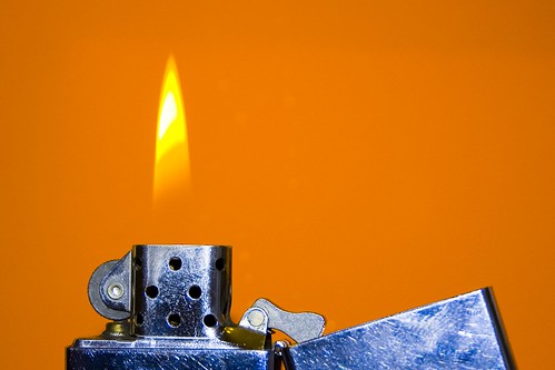
- Fire flame
- No flame
- Other kind of flame
- Image heavily enhanced/ altered
- Text in image
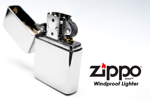
- Lighter standing up
- Lighter laying down
- Lid open
- Lid closed
- Lid open left
- Lid open right
- 1 lighter in image
- Multiple lighters in image
Results
- Fire flame: 3
- No flame: 4
- Other kind of flame: 3
- Image heavily enhanced/ altered: 4
- Text in image: 2
- Lighter standing up: 8
- Lighter laying down: 0
- Lid open: 9
- Lid closed: 1
- Lid open left: 6
- Lid open right: 3
- 1 lighter in image: 10
- Multiple lighters in image: 0

When I began this week’s assignment, I did not expect to find much correlation between images of zippo lighters. Never the less I set out on my quest anyway. After performing content analysis on 10 images of zippo lighters I have reached a number of conclusions. One in particular was the lid position. In 9 out of the 10 images I examined, I found that the zippo lighter lid was open. Only one image had a closed lid. Therefore, based off this data set, in images of zippo lighters the lid is open 90% of the time. Obviously, it would take hundreds of images to thoroughly determine whether this conclusion is accurate, but these results are very interesting.
I do not know the exact reason why most of the images had an open lid position, but most all of the 9 images that had an open lid position had something coming out of the lighter. My best guess is that the lighter is positioned like that so that something can be coming out of it. Whether that be a flame of some kind, smoke, or design, etc.. It makes sense because the essence of the zippo lighter is the flame, it is the reason they exist and that is what we think about when we see them. Therefore it is in the image creator’s best interest to capture the zippo lighter’s essence, in action, and this is done with the lid open.


